An Illustration is not a Logo
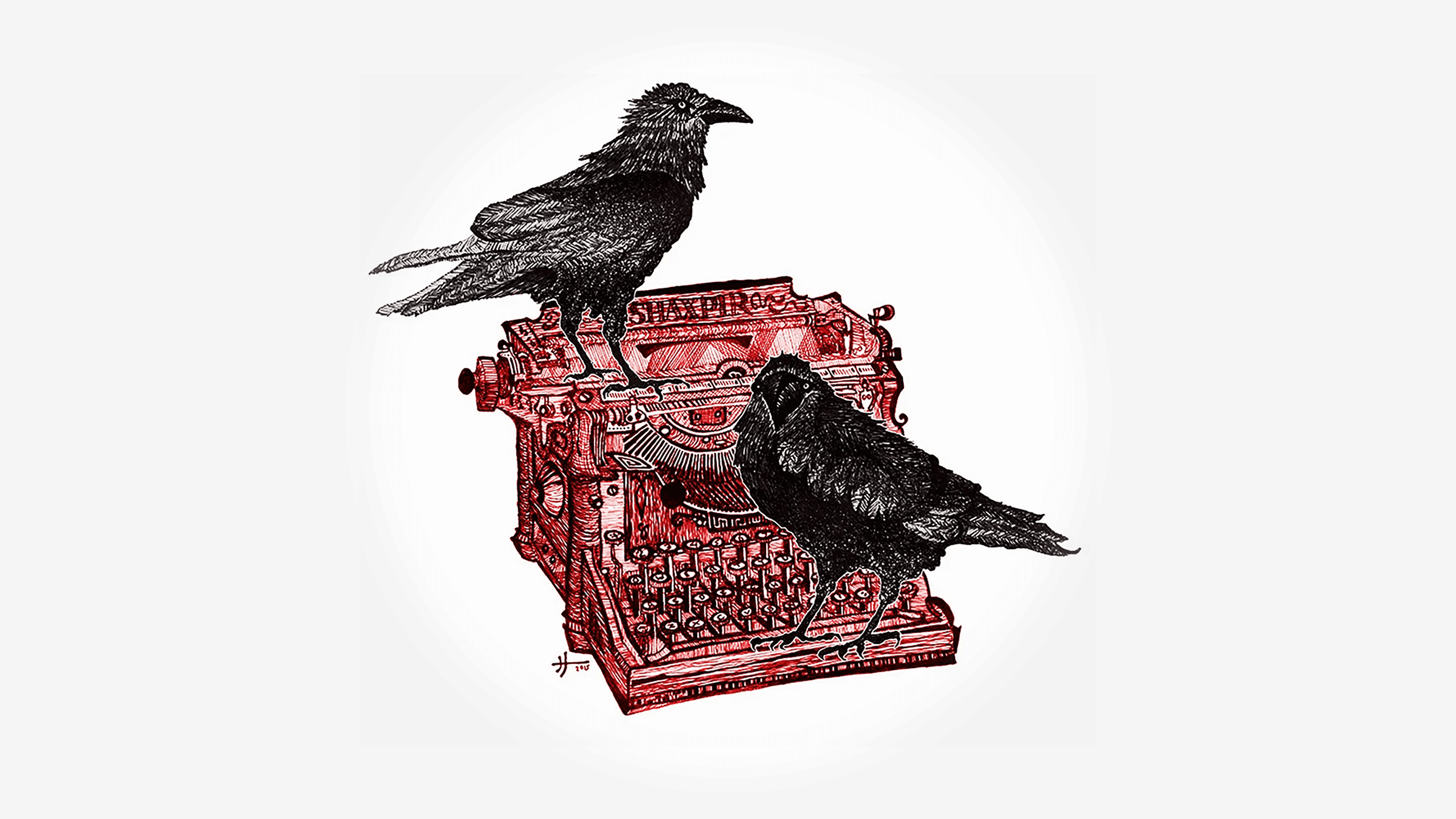
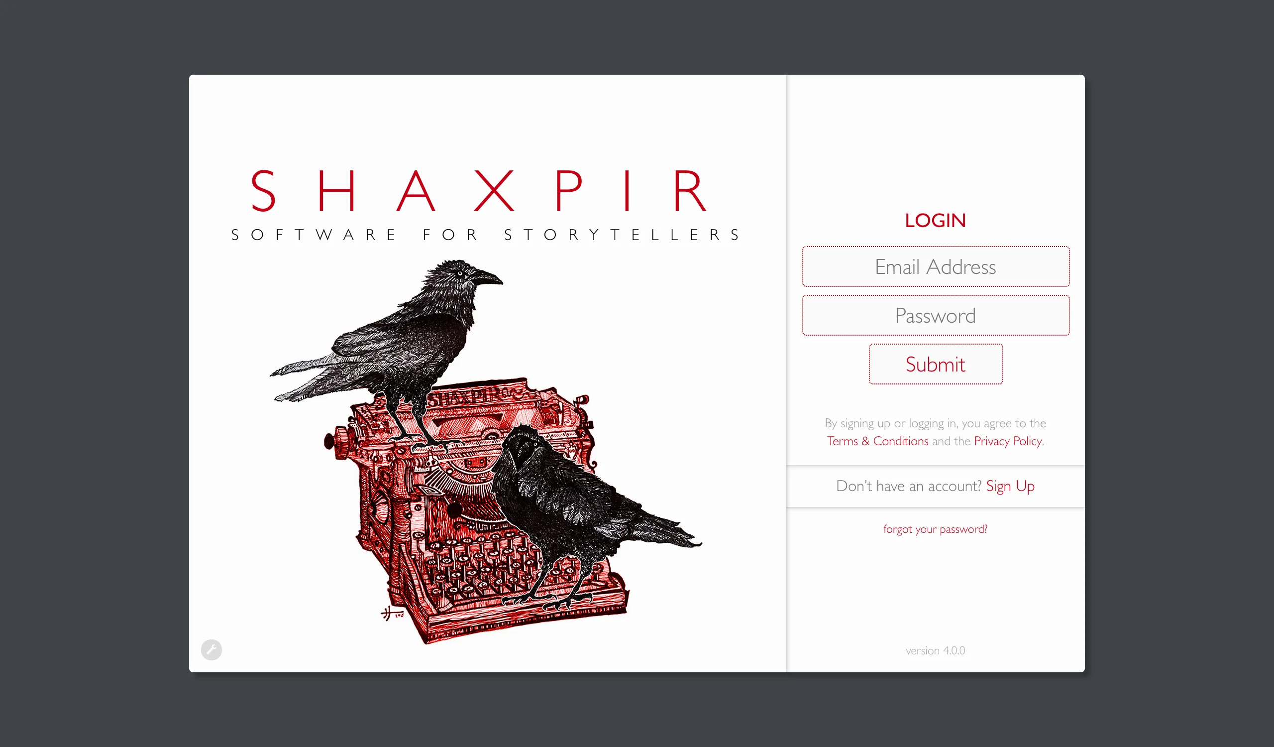
A few weeks ago, I blogged about the process of hiring a fine-artist to create the original logo illustration for the Shaxpir brand. The results of that project gave us the gorgeous graphics that still adorn our login screen today:
But, as much as we love this illustration, it has gradually become clear to us over the past few years that an illustration is not necessarily a logo, and we needed to invest in a clearer, more versatile iconography for the Shaxpir logo itself…
Logos are supposed to be simple and clean — just as clear and legible at every size — and the existing logo definitely wasn’t cutting it. Here’s what the Shaxpir illustration looked like when reduced to the size of an application icon, in the Mac OS dock:

What a mess! It’s hard to recognize anything at all from the logo at this size. With all the intricate crosshatching of the original drawing reduced to the size of a fingernail, it had become almost impossible to identify the ravens, much less the typewriter.
We experienced the same problem throughout our website, on all our social media accounts, and in the software our users installed on their computers. Especially at small sizes, it just didn’t convey our simple-and-modern-but-quirky brand values, and so eventually, we went back to the drawing board.
With the release of Shaxpir 4.0, we hired legendary icon designers Louie Mantia and Alexa Grafera, from the iconic design studio Parakeet.co, to create us a new icon with the same spirit as our original iconoclastic illustration. We gave them complete creative control to re-interpret the illustration with a modern sensibility, and the results are clearly superior:

Even drawn at the smallest possible size, in the Mac OS dock, the new icon is clear and easily recognizable:

It conveys the same disquieting literary sentiment as the original illustration, but with a modern minimalism that reinforces the simplicity and clarity of our brand identity. That’s the benefit of hiring brilliant designers: they bring years and years of expertise expressing complex ideas with simple, elegant, and iconic imagery.
You’ll see this icon throughout our branding now. It’s on every page of the Shaxpir website, it’s used throughout our social media accounts, and it’s the application icon for our desktop software. We’ll use this new logo on all of our future design materials, from business cards to tee-shirts, and eventually (we presume) emblazoned on the sides of rockets launched into outer space, traveling to distant galaxies.
Although we still love our original illustration and continue to use it at large-scale on our application login screen, the new logo gives us a much-needed upgrade to the Shaxpir corporate identity. It conveys our core brand values, while reducing the complexities of the original illustration to their bare essence.
And that’s exactly what a great logo should do.
Sign up for our latest release, Shaxpir 4: Everyone, which gives any author the power to brainstorm, outline, write, revise, and publish a complete novel or memoir. Free for anyone, anywhere. For free, forever.