Custom Themes
As a productive working author, you spend a lot of time in front of a screen.
Maybe you wake up early to write with the rising sun, or maybe you prefer to write in the lazy warmth of the afternoon. Sometimes you write late at night, when your eyes are tired, on a laptop screen next to a sleeping partner. And sometimes, you just want a change of scenery or a different mood.
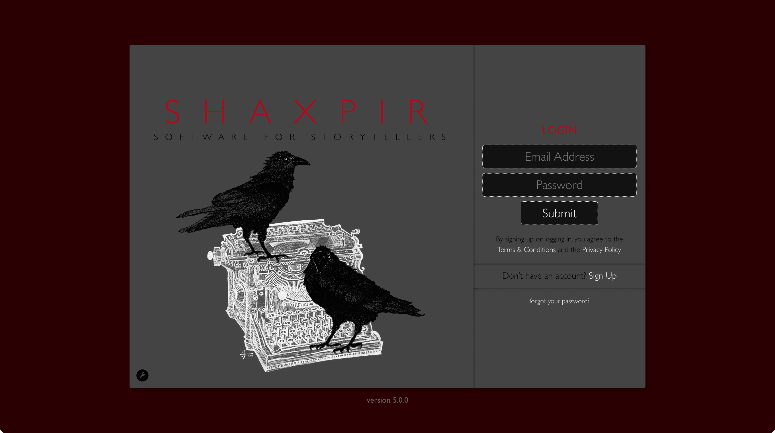
Users of Shaxpir Free, will always experience the application through the default Atwood theme. Paid Shaxpir Pro subscribers enjoy the ability to choose from any of the seven high-quality designer themes in our collection, each with its own distinct visual style:
ATWOOD
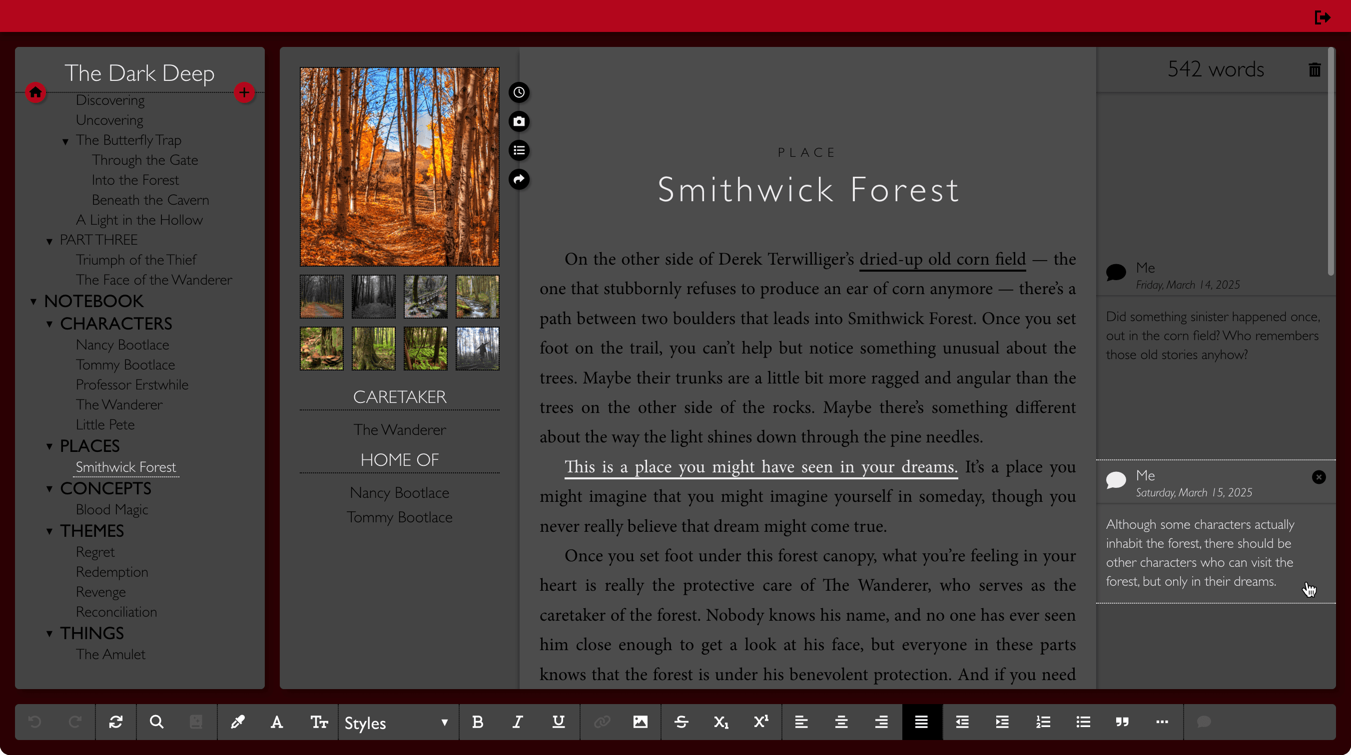
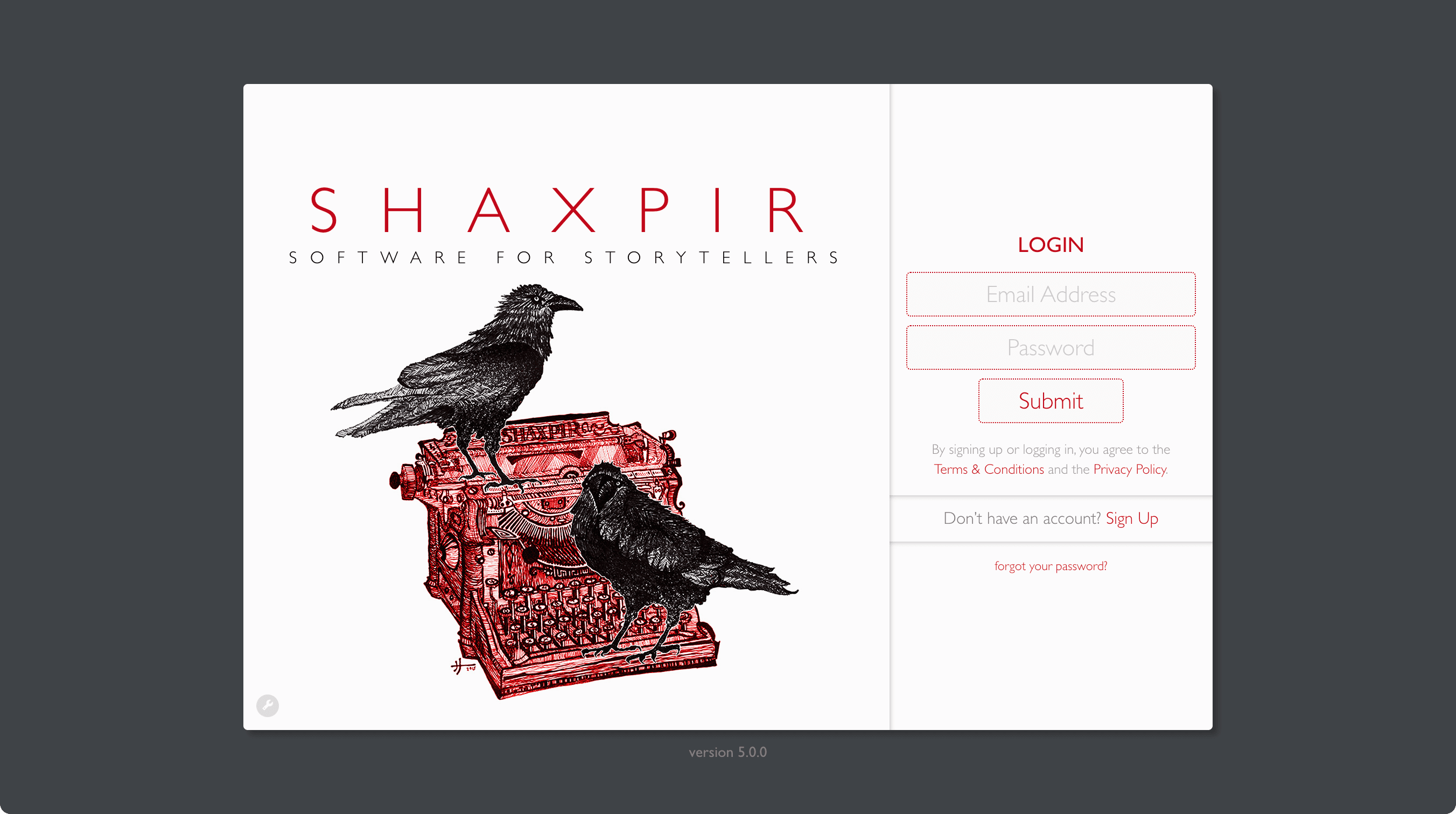
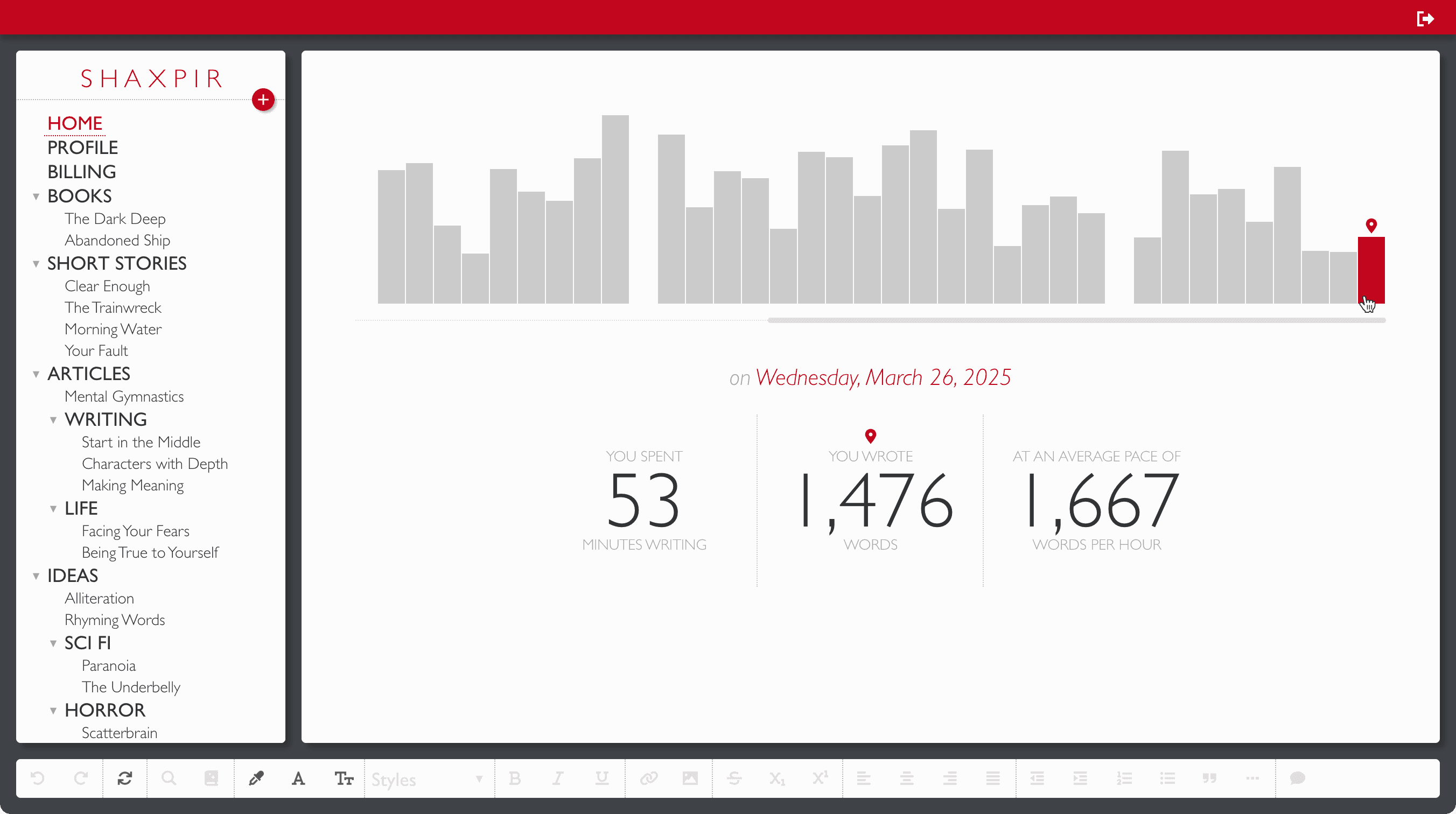
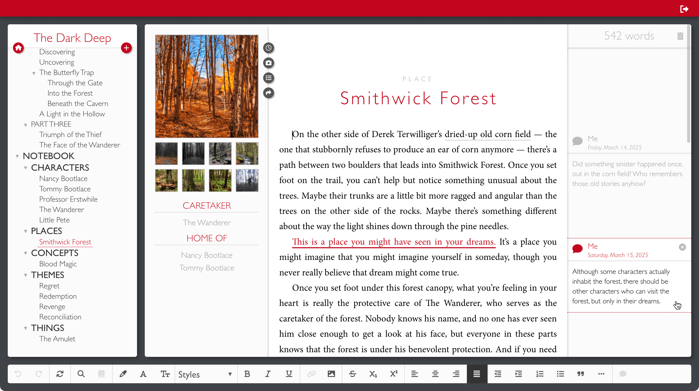
Our default Atwood theme presents a clear visual hierarchy of content, using different shades of grey to focus an author's attention on the craftsmanship of their prose, while de-emphasizing the less-important secondary content in the margins.
This theme uses the clean & classic Minion typeface for prose editing, a bright white workspace for daytime writing, and our distinctive off-red accent color against a slate-grey background.
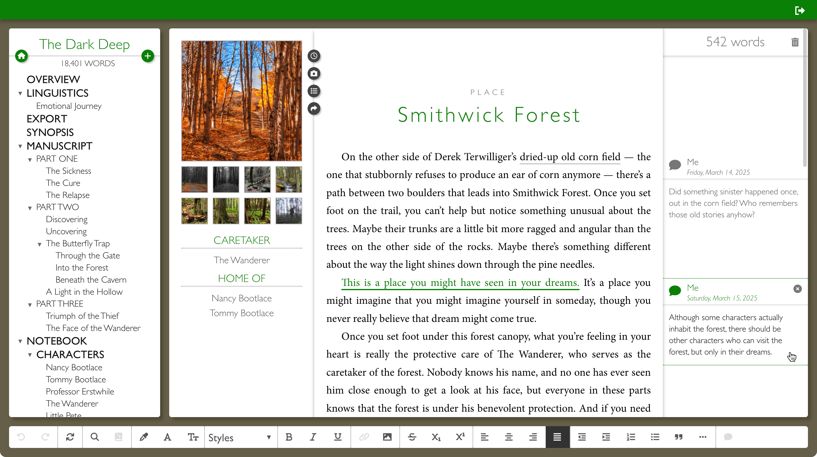
SALINGER
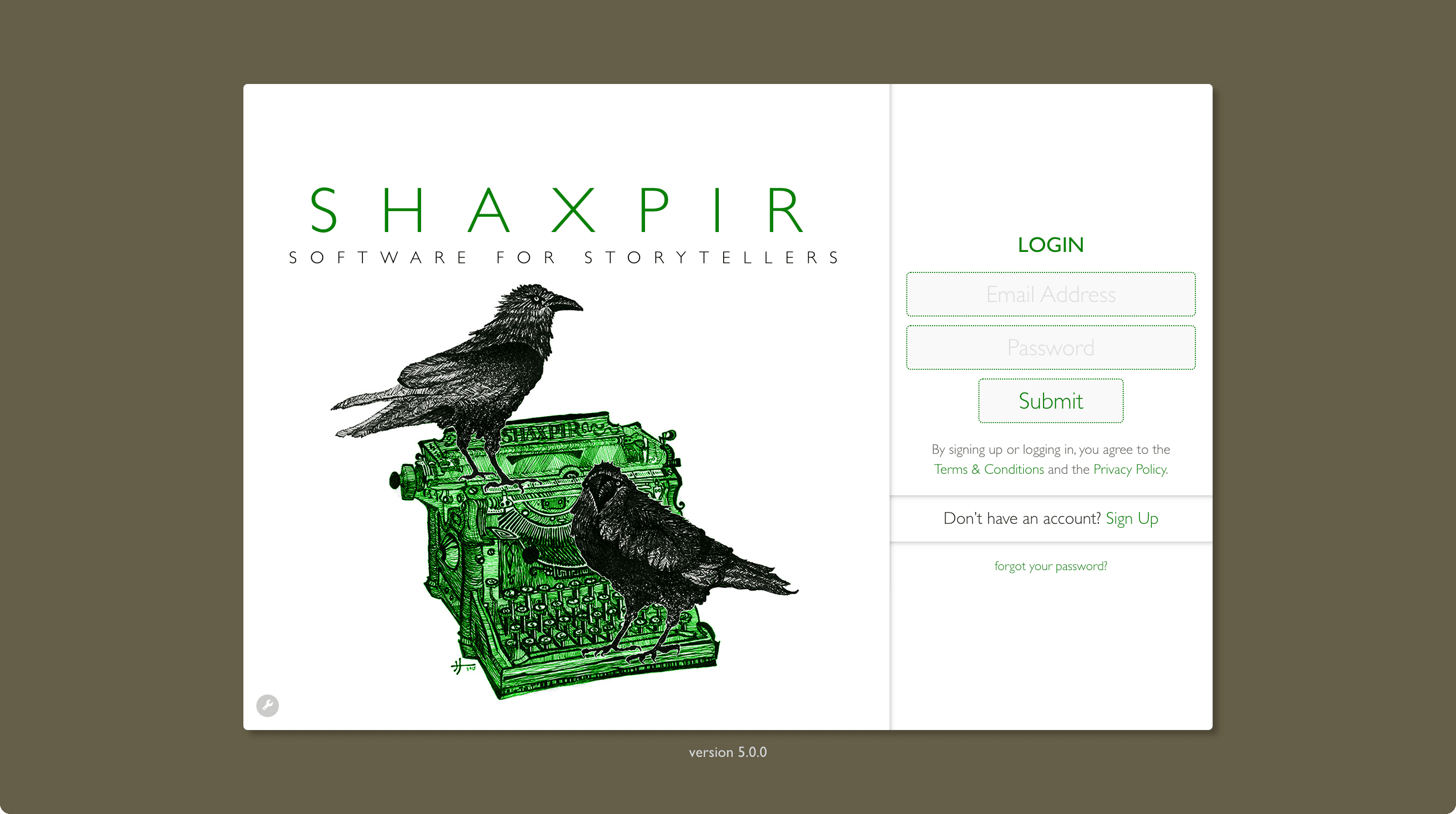
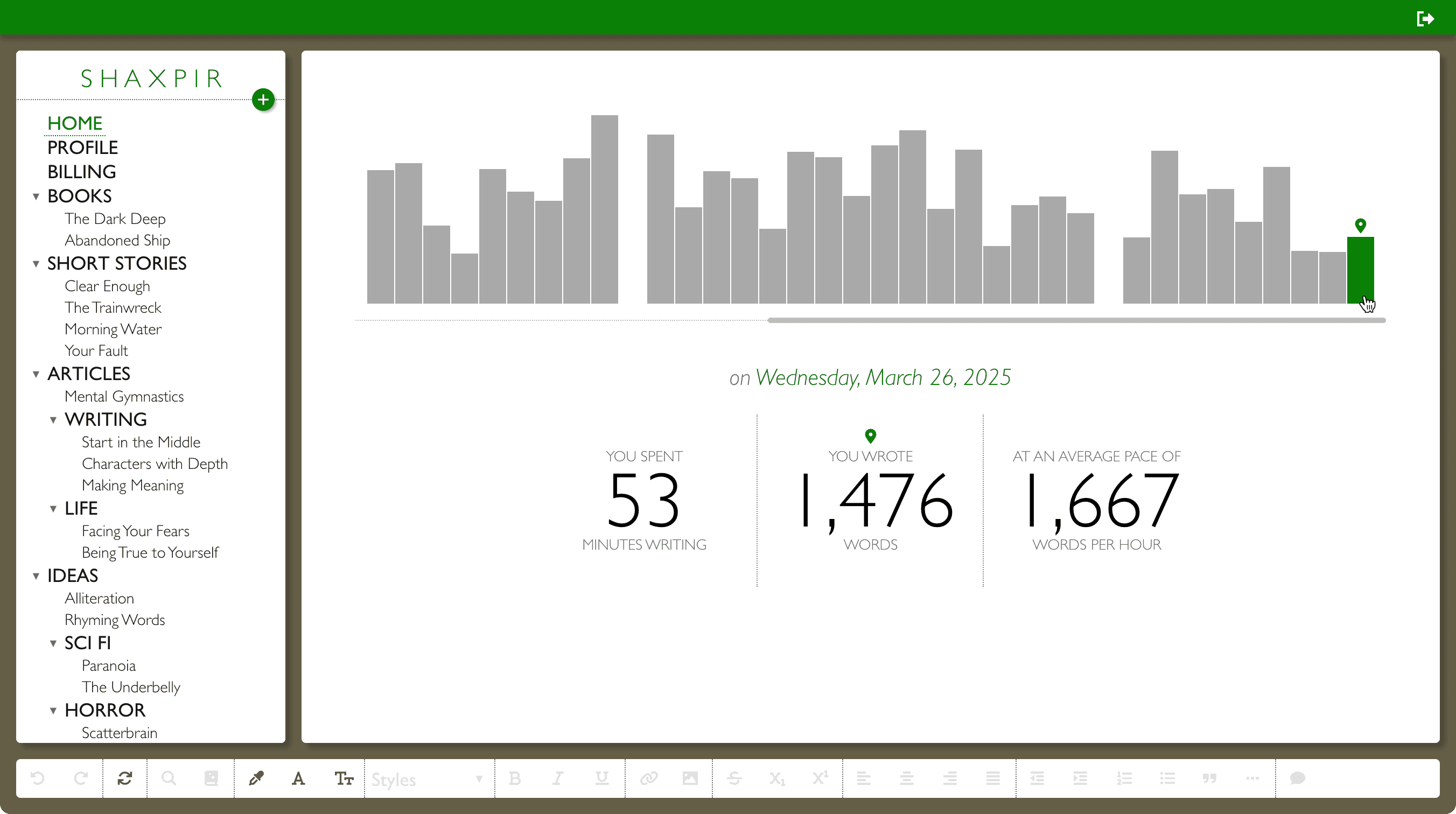
There's nothing phony about Salinger, our most easily-readable theme, with crisp background contrast throughout the design, and using the sturdy, legible Merriweather typeface for prose editing. Boasting our brightest white workspace, and earth-toned color scheme, Salinger is perfect for long afternoon writing sessions in bright daylight.
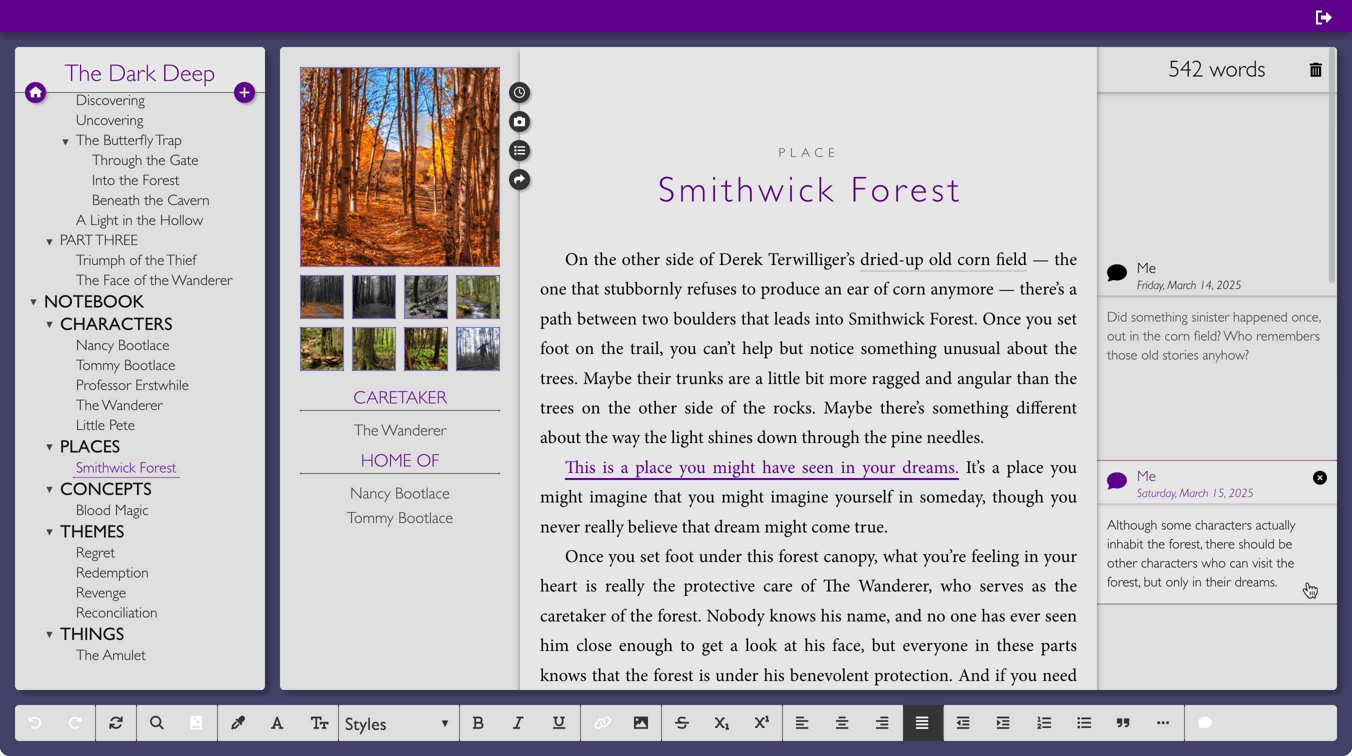
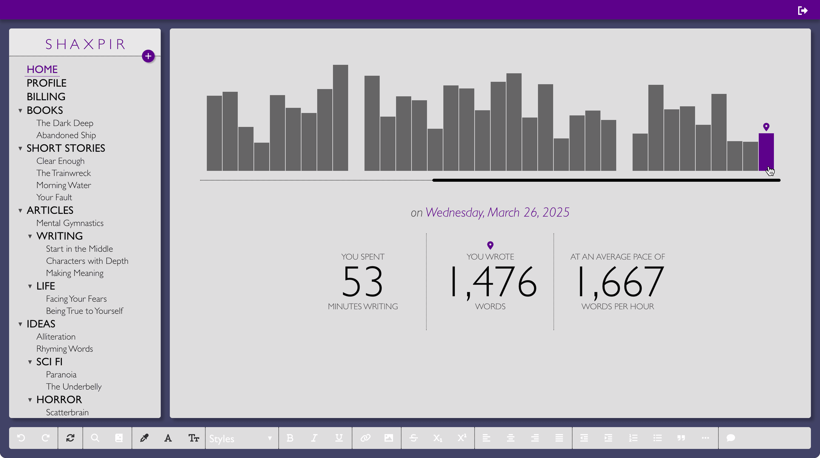
VONNEGUT
And so it goes… Vonnegut is a daytime theme with just a little bit of darkness. The pale grey workspace is set against a windsor blue background, with violet hum accents. Prose is set using the strong, confident serif of the Vollkorn typeface, perfect for a bleary-eyed novelist scratching out a few chapters before a hearty breakfast of champions.
SHELLEY
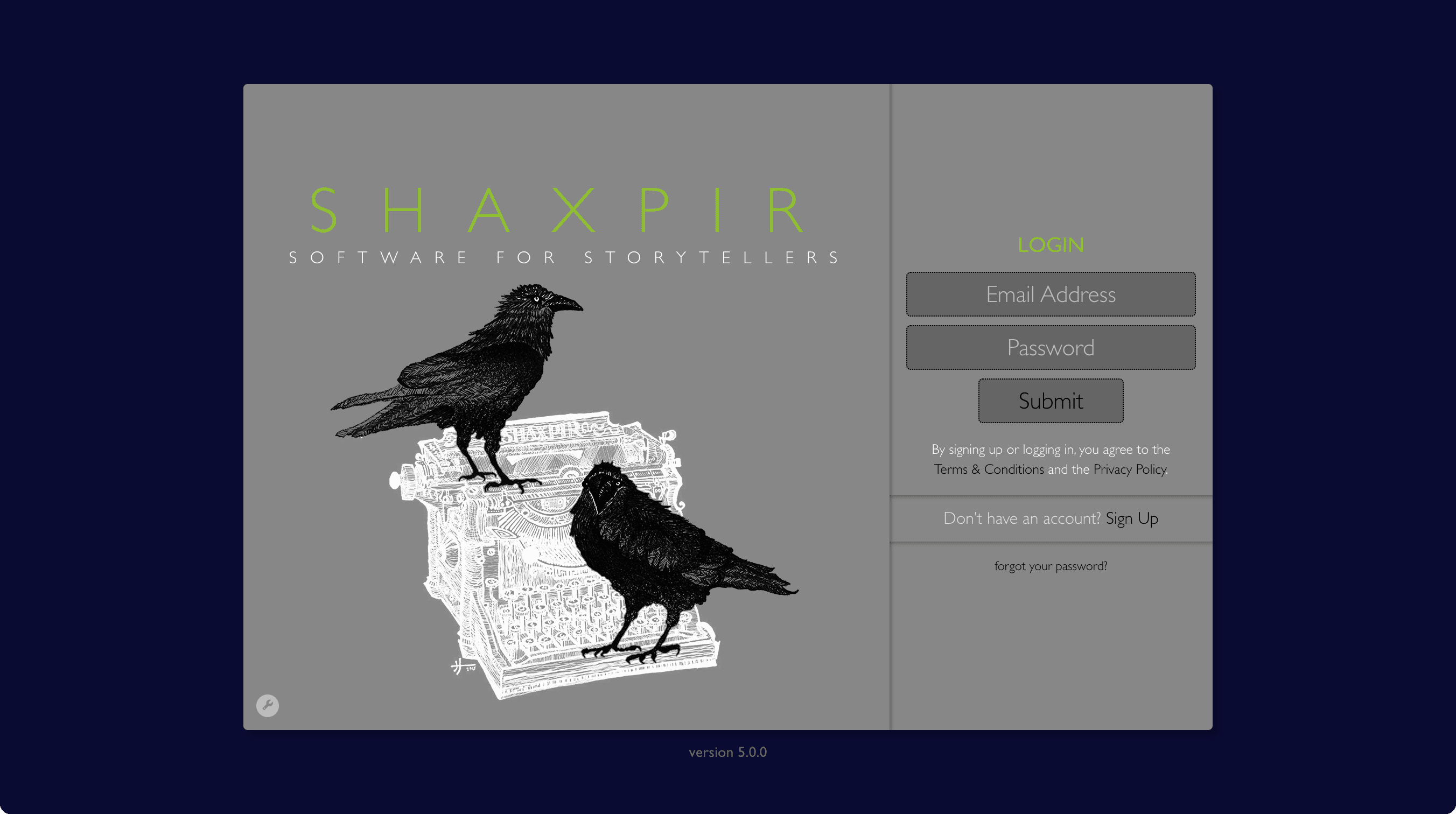
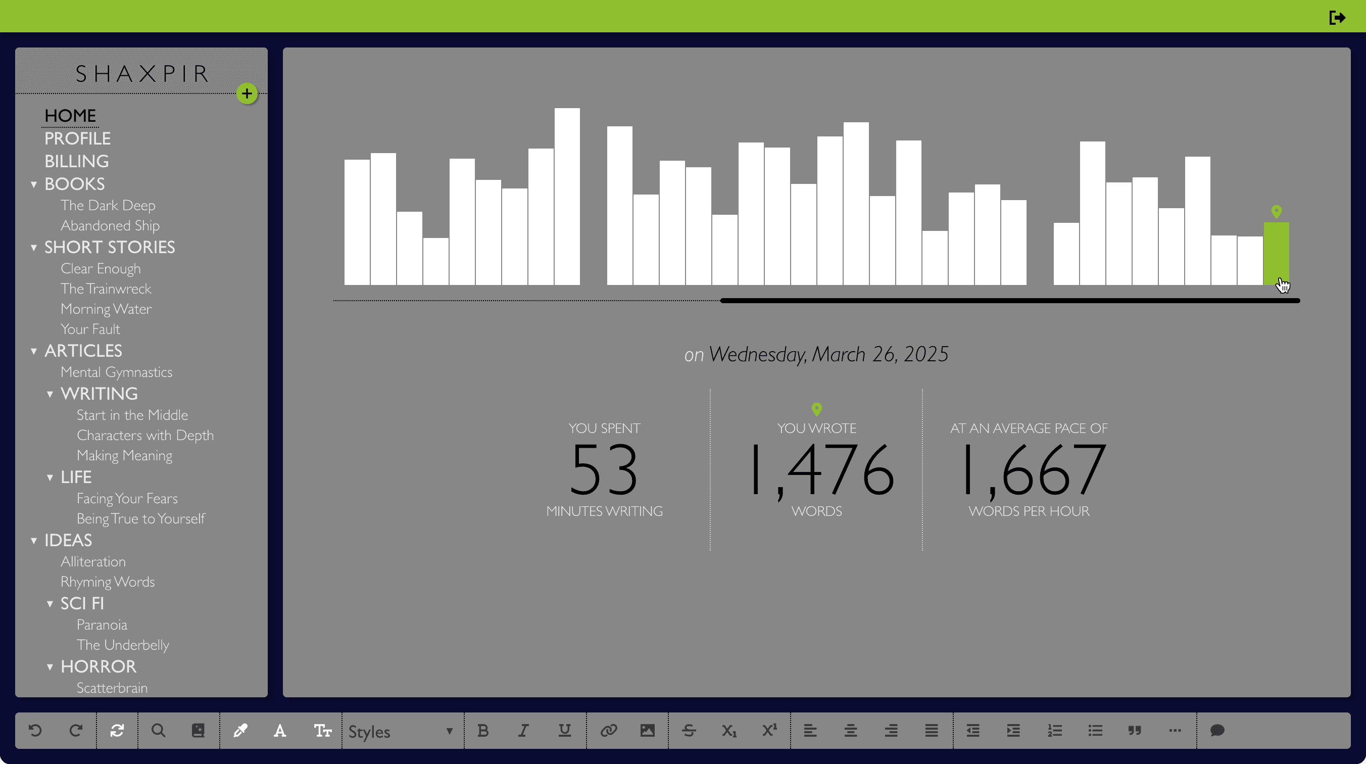
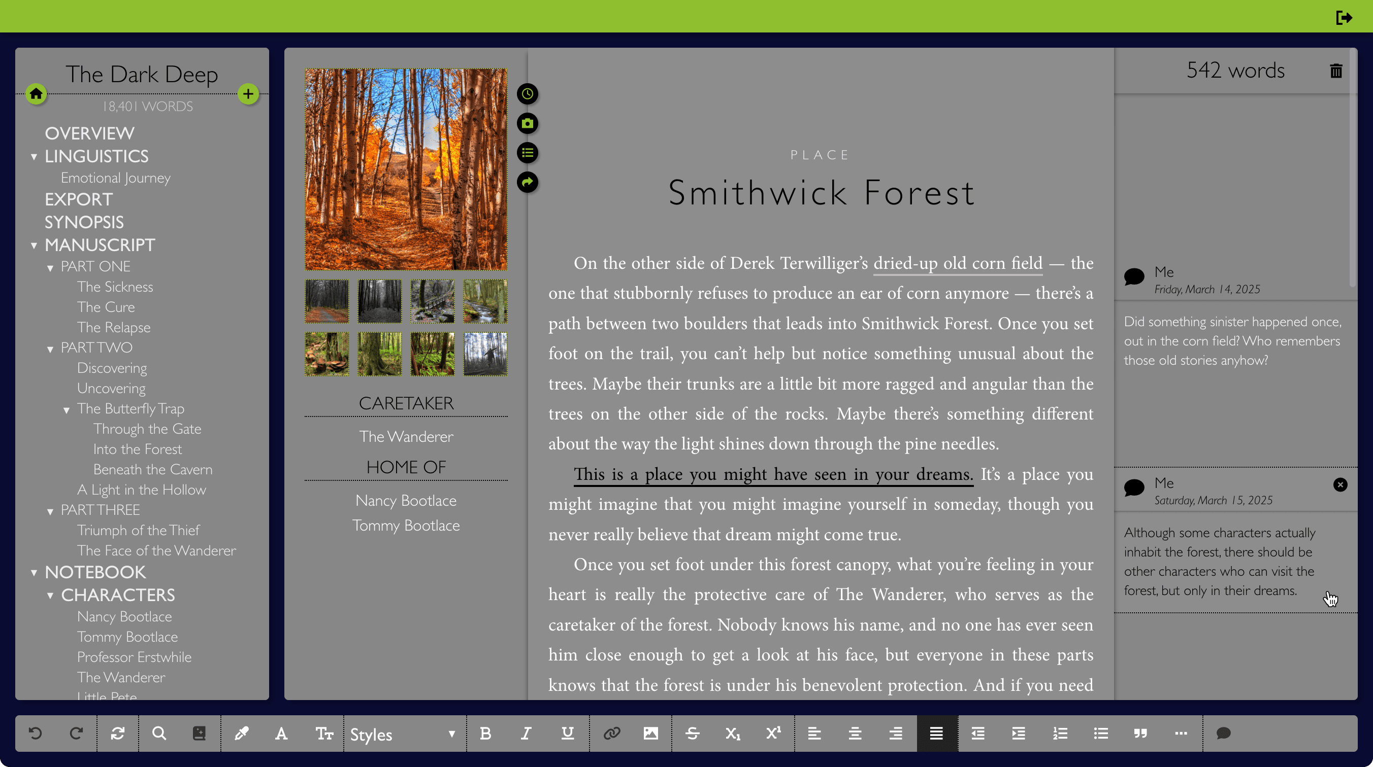
Shelley is the first of our nighttime themes, employing a medium grey workspace against a midnight blue backdrop and stitched together with electric pear highlights. Bring your words to life with the elegant yet modern lines of the Lora typeface, rendered in an easily-readable light-against-dark style.
DEVERAUX
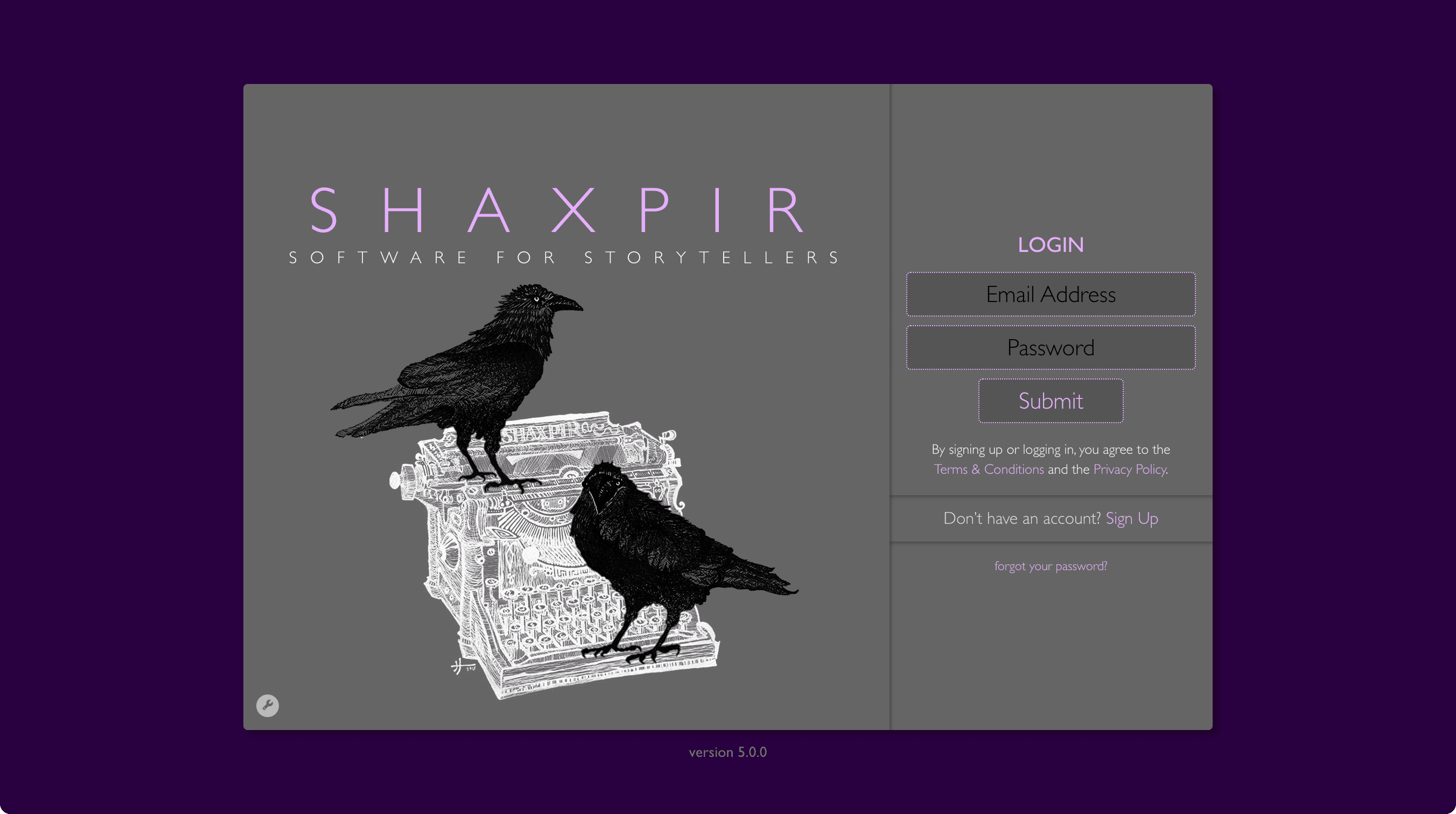
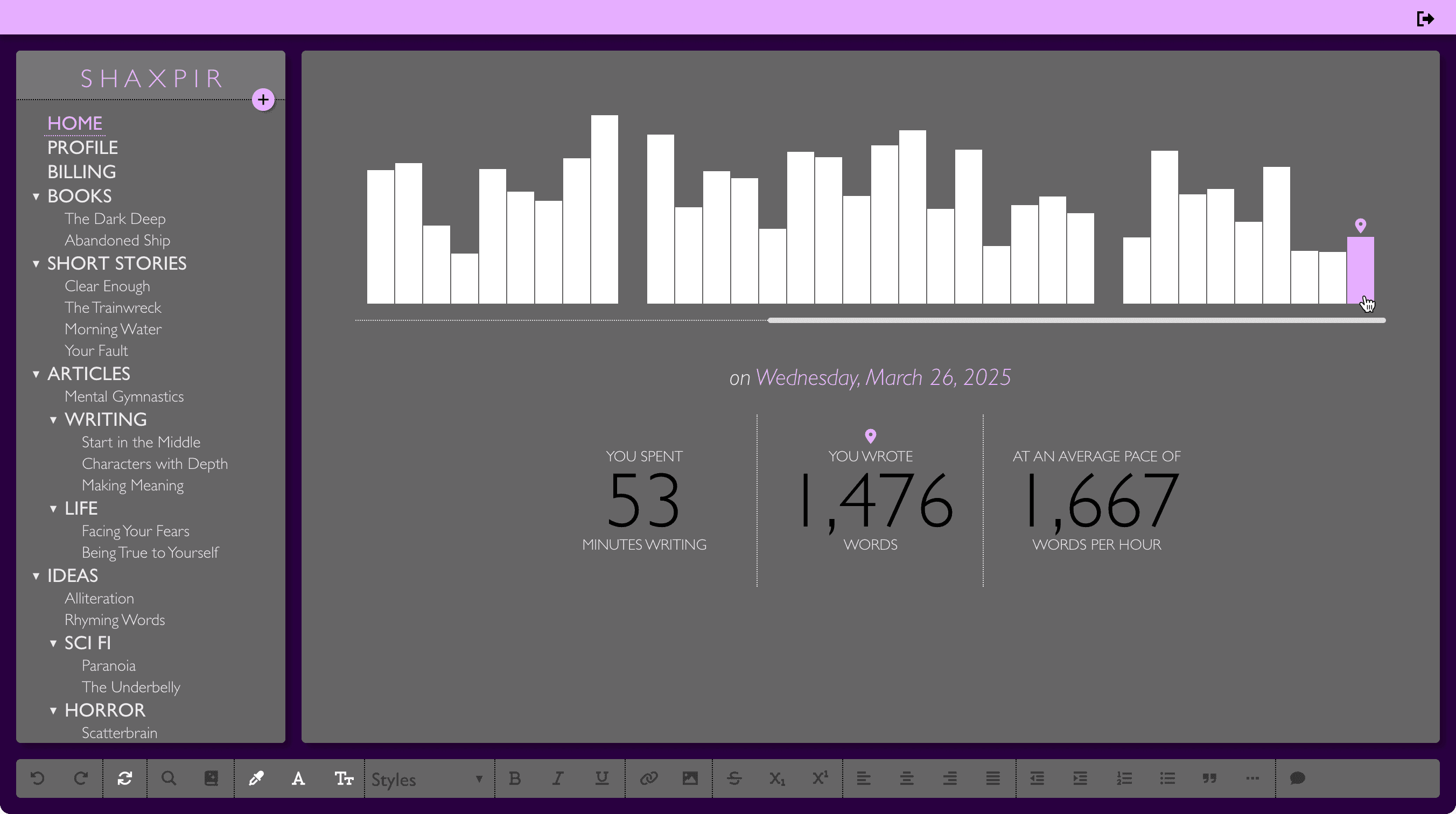
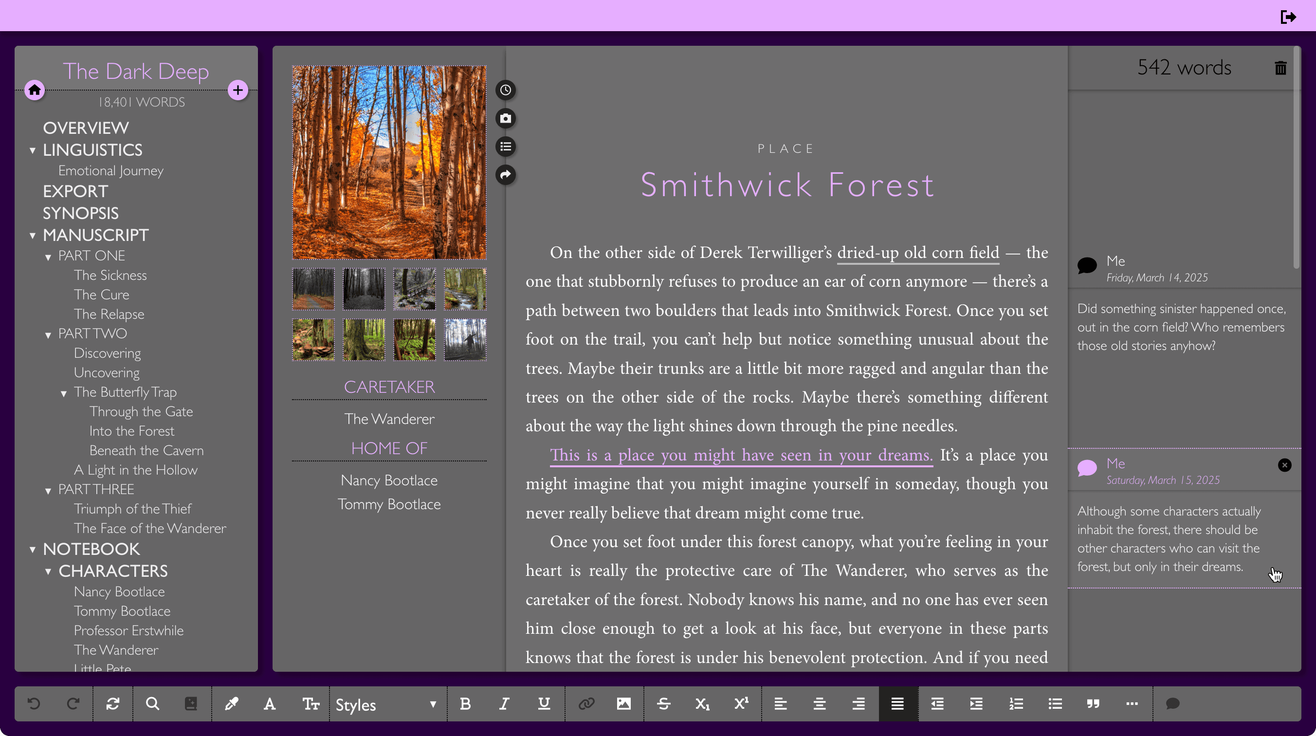
As the evening deepens, get comfortable in Deveraux, the second of our nighttime writing themes, with its ripened eggplant background and dusty-tulip accents. Your prose has plenty of room to stretch out, using the relaxed spacing of the Noto Serif typeface, set light-against-dark on a dimly-lit panel.
BRADBURY
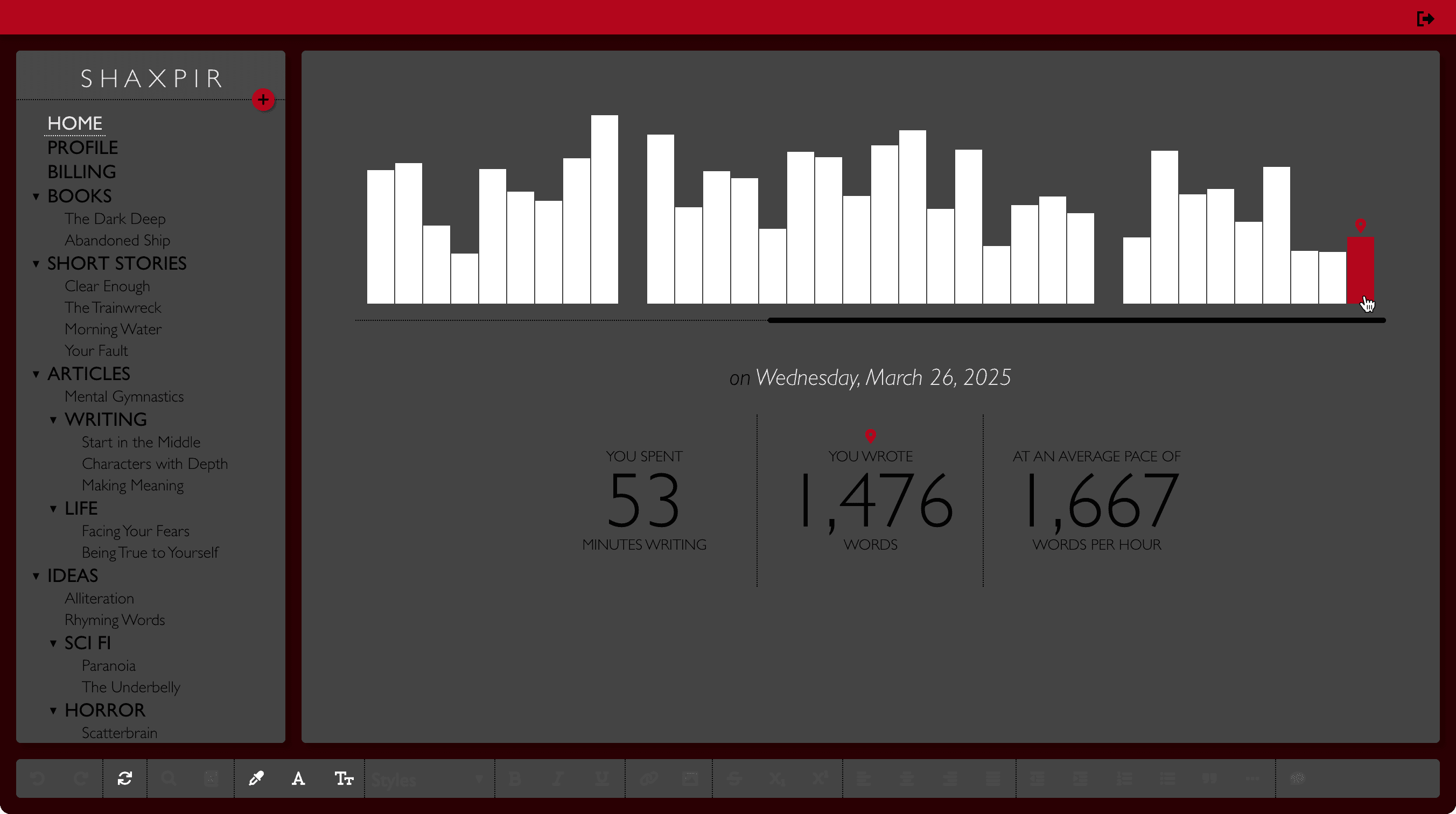
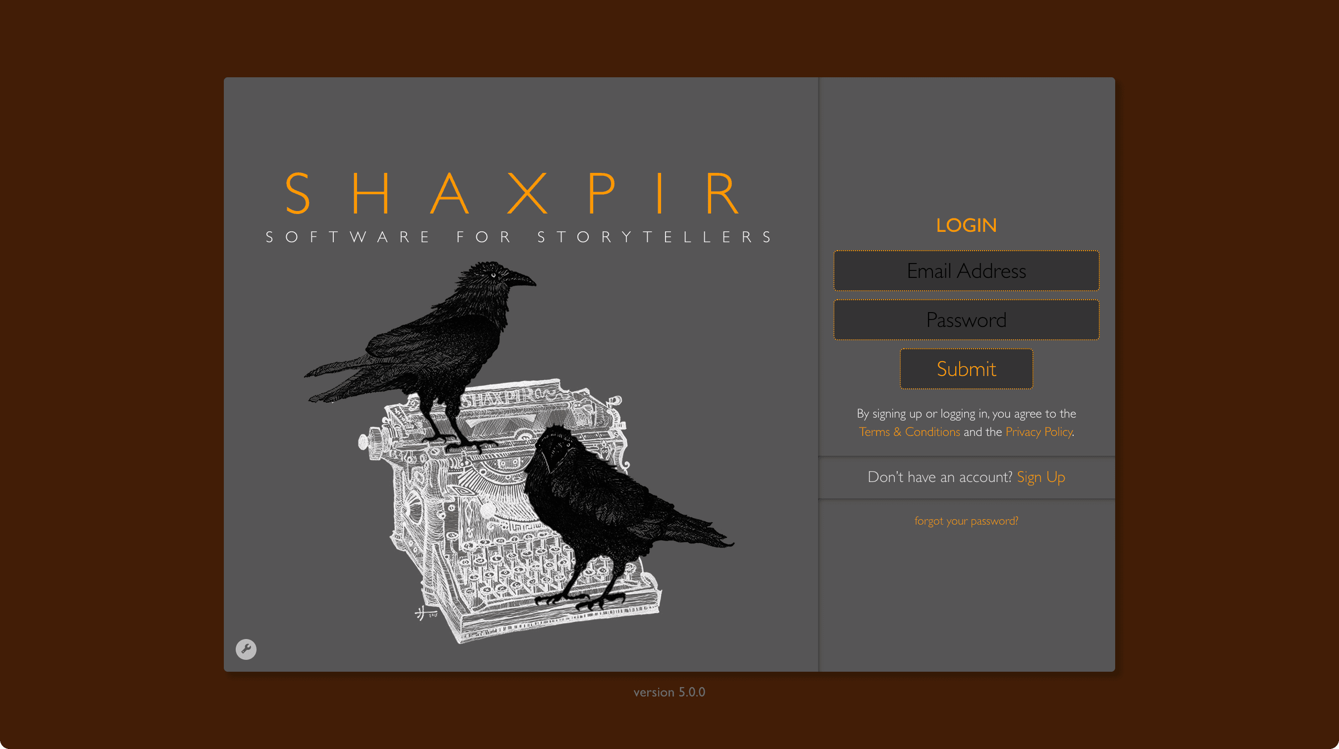
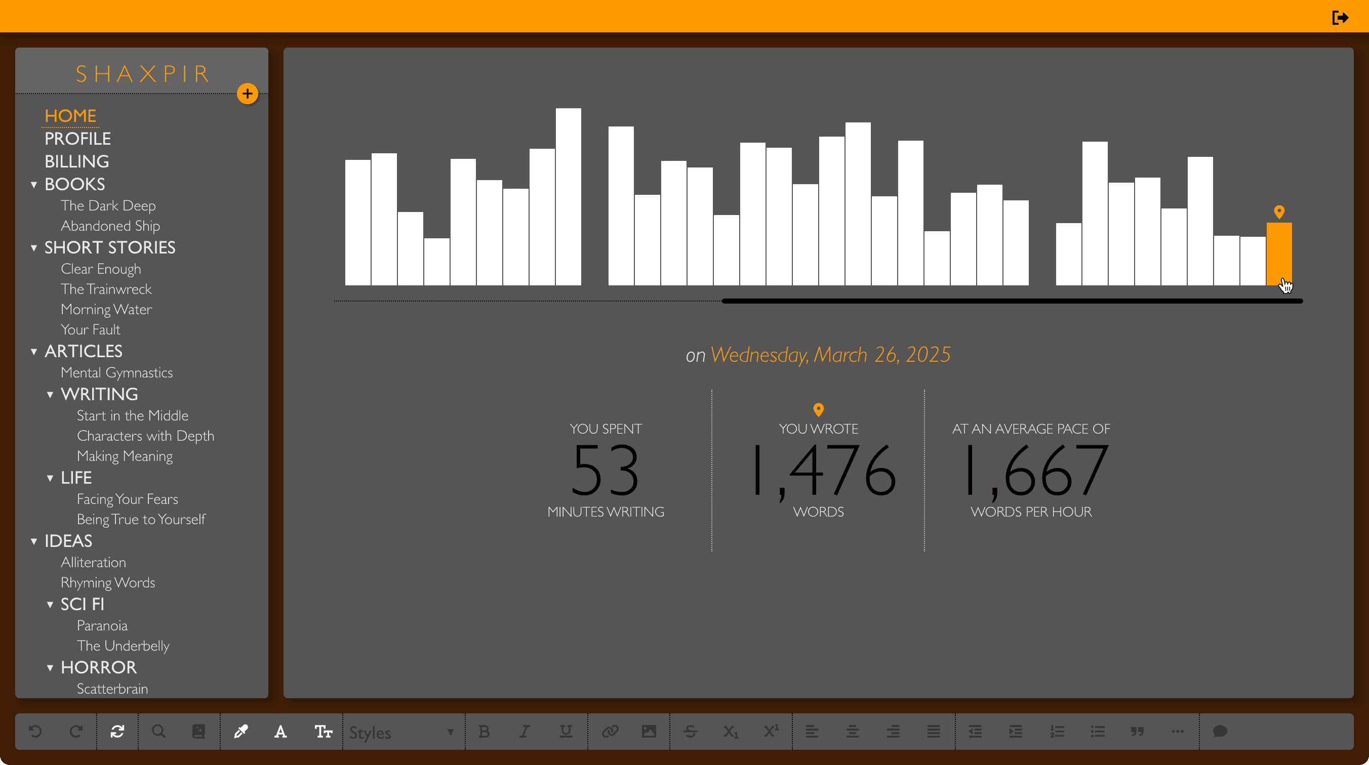
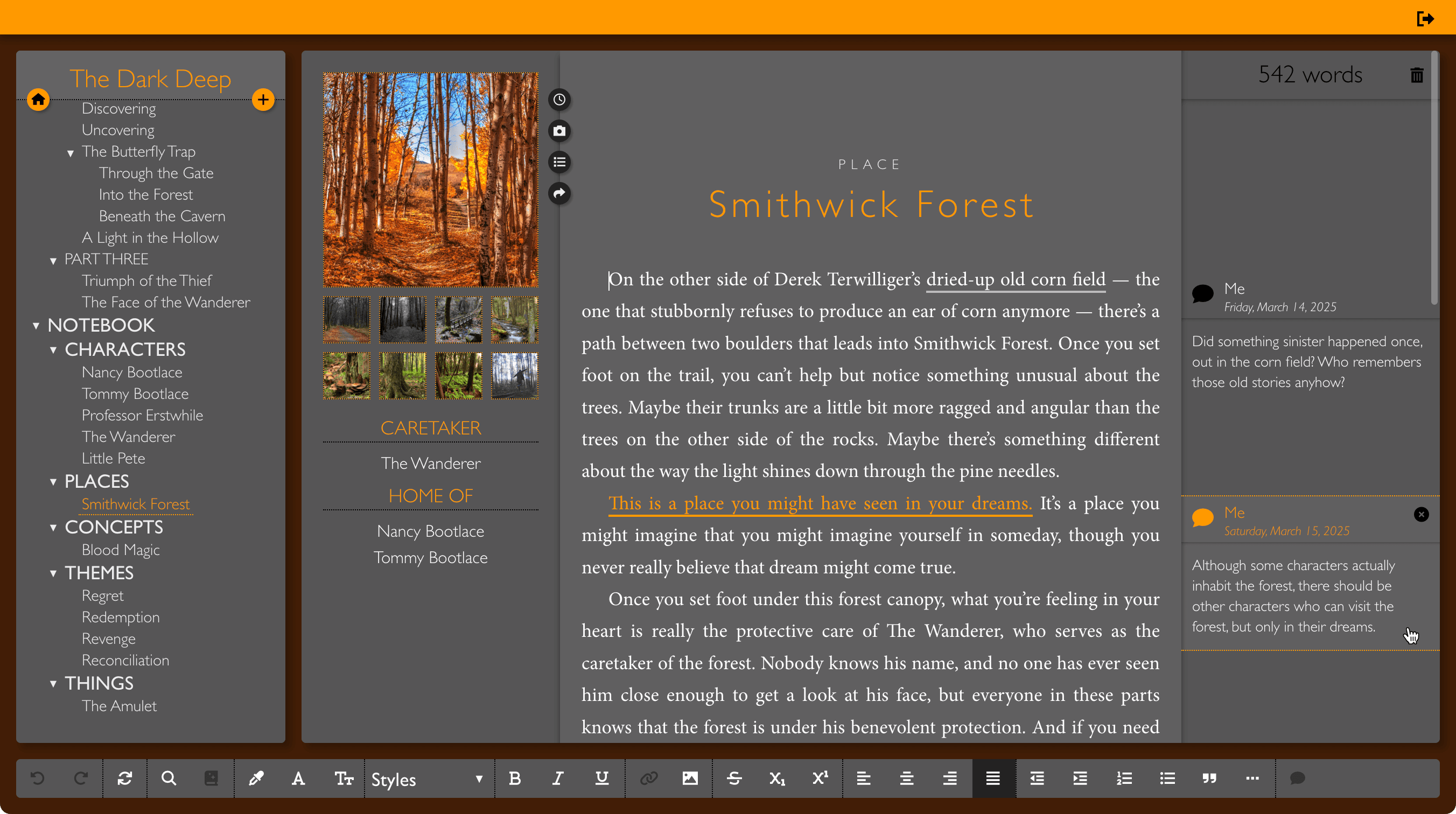
Feel the chill of a dark October night with Bradbury, the third of our nighttime themes, with an autumn brown backdrop and pumpkin gold highlights, set against a charcoal grey workspace. Lines of prose are humbly and dutifully engraved, light-against-dark, in the precise letterforms of the Crimson Text typeface.
LOVECRAFT
The darkest of our nighttime themes, Lovecraft, renders black obsidian text and blood-red highlights against a pinot noir backdrop and an ash-colored workspace. Prose is boldly forged with the enlarged slab-serifs of the Arvo typeface, using a black-on-black rendering style fit only for the longest and darkest of nights…
